Whitewall Creative
SELF-INITIATED UX/UI DESIGN | RESEARCH | STRATEGY
Background
Whitewall Creative is an international 360° design, digital, and live events agency.
Challenge
I set myself the task of exploring how an agency website could be restructured to highlight expertise and encourage prospective client enquiries.
Solution
I explored how a creative agency digital solution could be optimised to emphasise breadth of services, communicate credibility, and support client acquisition.
Roles
UX Researcher, UX Designer, UI Designer
Team
Solo Initiative
Timeline
10 weeks
Discovery
In analysing the market for competitors, I found that there are very few direct competitors as far as 360 degree design and events agencies that offer global services, which is good for Whitewall.
When evaluating competitors of the same scale, the common themes that seemed to come up were clean and engaging visuals and clear evidence of prior work and services offered.
Competitive Research


User Research

Interview a mix of staff and potential clients to assess their needs. Discover what the company wants to present and what clients look for when they're evaluating a new studio.
Research Plan
Explore how people experience creative agency websites to understand what makes them useful and inspiring when they're considering potential partners.
Objective 1
Explore how Whitewall Creative’s team perceives the studio’s identity, values, and ideal clients, and gather their perspectives on how potential clients first encounter and evaluate the studio.
Objective 2
Users need to see an agency’s creative expertise so they view the agency as a creative collaborator, not just a logistical partner.
Users need clarity and reassurance on capacity and process to confidently entrust large, complex projects without straining their own resources.
Users need clarity on an agency’s 360° offer to understand how services integrate seamlessly to support their needs.
Users need ease of access to information and services so the “white glove” experience feels tangible and effortless.
Problem Statements
User Research Insights
Users need insight into an agency’s culture and people to ensure alignment and recognise the value of diverse creative backgrounds.
Users need confidence in delivery because past agency experiences of overpromising and underdelivering have eroded trust.
Users need ongoing support and alignment to feel secure in the partnership and free to focus on their priorities.
Defining

User Persona
Name Jordan
Age 36
Job Title Marketing Director
Jordan is a Marketing Director at a mid-sized Silicon Valley tech company. They’re analytical and creative, want bold and accessible event design, and value clear, efficient communication. With a busy team and family life, they seek long-term creative partners who “get it,” bring fresh ideas, and deliver seamlessly so Jordan’s team can focus internally.
They are colour blind but love colour, so they need to work with companies that get that and prioritize accessibility needs.
Jordan’s company is launching a new AI-powered analytics product in the US and UK with a hybrid event spanning London, San Francisco, and global streaming. Their team is overstretched, so they need an agency to handle everything, from branding to execution, while delivering creative, standout experiences that go beyond a typical corporate launch.
Jordan’s Problem

User Journey Map
SEO and outward presence, standing out among the crowd. It's the first step in awareness.
Clear communication from start to finish
Showing ingenuity helps companies stand out in a sea of shouting
Being easily contactable, at every step of the process, so they can move forward once they think they're on to a good fit
Insights - What’s important to Jordan
Not being overloaded with information, information is clear and concise prioritising time and getting to the point
Offering a clear White Glove Service
Providing evidence of success and skills
Once they get to the meeting: the company is prepared and understands Jordan and their needs well. Even if they're new, they should feel like an old friend.

Feature Prioritisation
In prioritizing features, it was clear that contact was important to users as well as clear values and proof of expertise. I prioritized features that upheld these principles and put things that I thought were "nice to haves" lower on the priority list.
Though, it would become clear from further research that the insights page should have sat in the high effort high impact quadrant.
make Jordan feel like they’ve met their perfect match?
ease bringing people in for those important face-to-face vibe checks?
make Jordan feel at ease?
HMW…
How Might We Statements
help Jordan trust that Whitewall’s got this and will deliver an innovative experience?
get Jordan excited about the possibilities?
Designing

Sketches


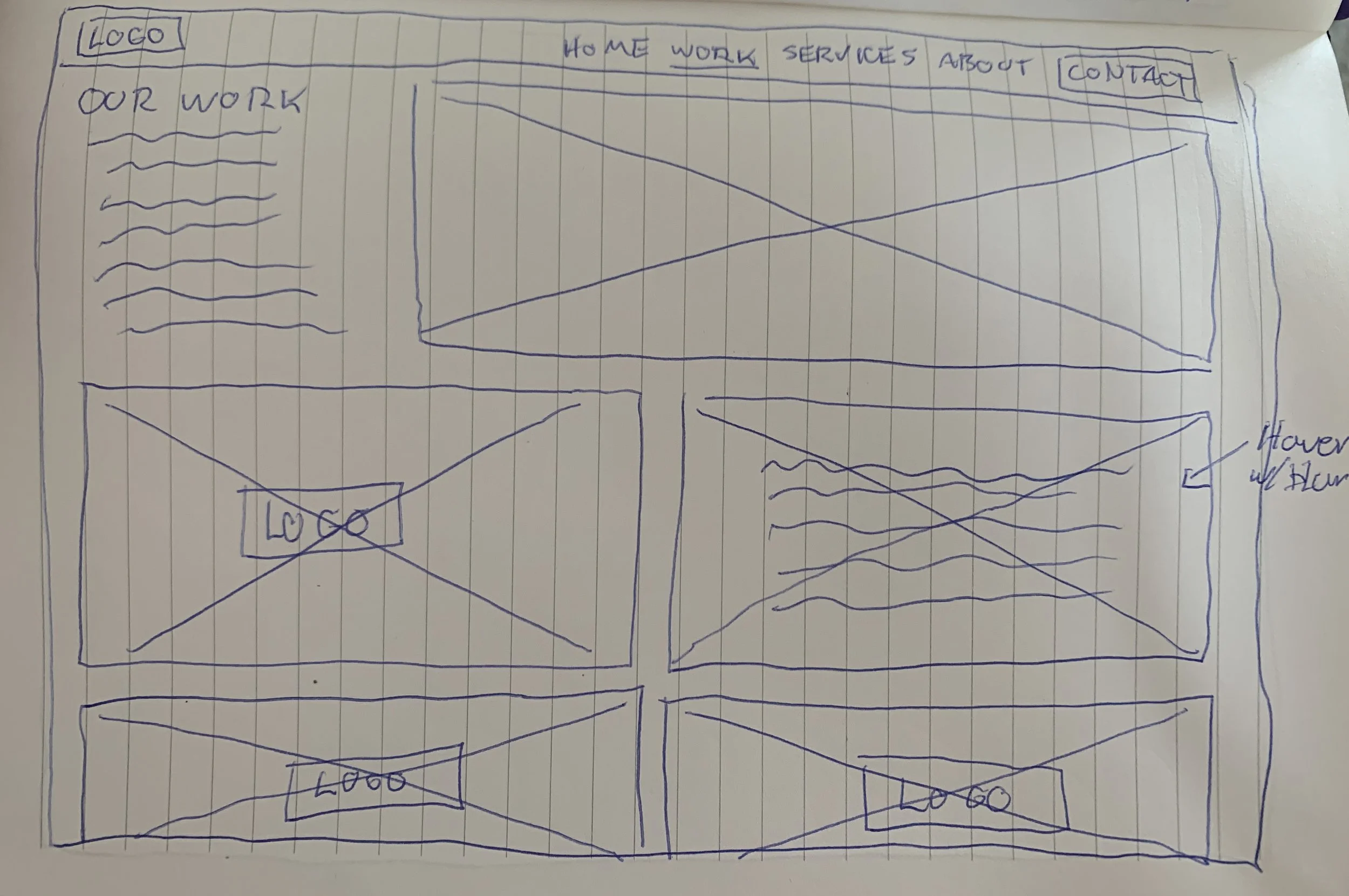


I started thinking about means of cultivating trust and interest through visuals, testimonials, clear services, and integrating something like a calendly form so users could get to those important face-to-face conversations quickly.
Low Fidelity Wireframes
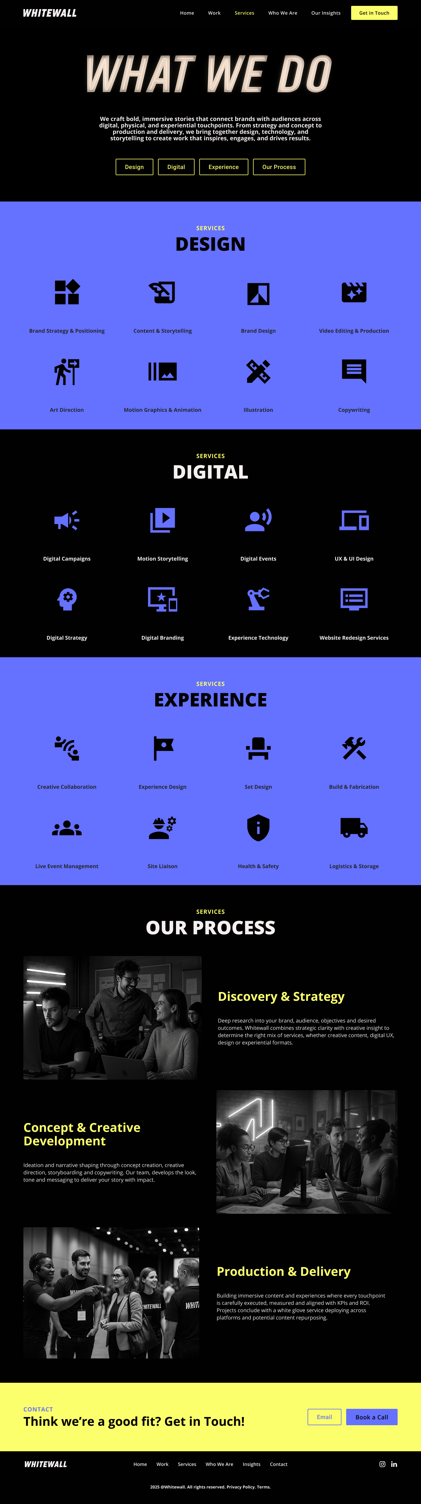
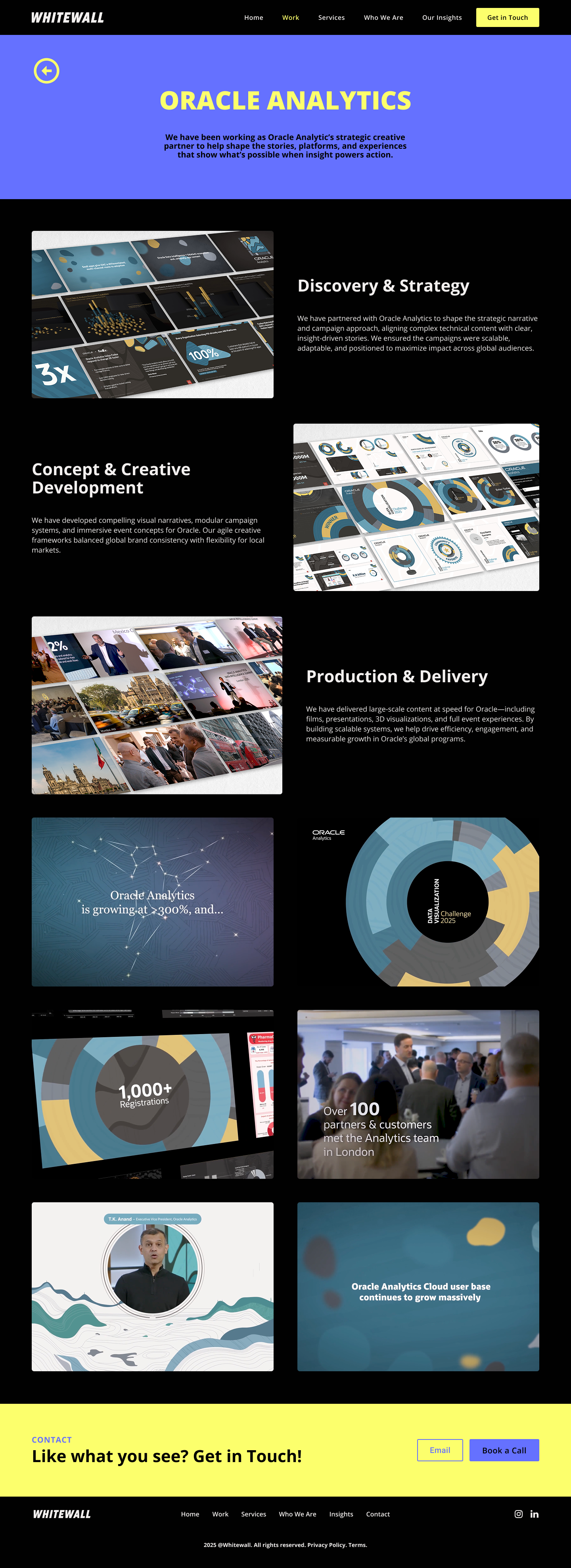
From the sketches, I developed wireframes. Organizing information in a way that prioritised visuals and showcased the services users said were important.
I added a section to highlight the process the company offers and a section to give high-level information about the big clients they work with because sometimes projects are under wraps or a case study might not be ready, but it gives us the option to showcase clients.
I wanted to highlight the people who work there and their diverse backgrounds to provide context of fulfilling wide niches so I developed an individual about page to give more information.
The contact page highlights the offer of a calendly, getting users to those important face-to-face chats while also giving them the option of filling in the contact form.
Wireframe User Testing

Task 1 | Show me how you assess the experience of the company
Task 2 | Show me how you learn more about the company's culture
Task 3 | Show me how you reach out to the company
Insights
Homepage
How This Affected the High-Fidelity Prototype
In response to User concerns about clutter and a need for a variety of layers of information throughout, I added a separate header section and separated out the mission statement to reduce clutter and anchor the company name.
I also added clickable arrows to the next section of the page to make page navigation clear and guide users through the homepage.


Users need more forms of contact because some prefer email and like the trustworthiness of seeing a physical address and some are scared by the calendly
Testing wording is key, some users were confused by the wording in the first task, which affected the test


Tasks


Users need a variety of means to navigate the site because they have different methods of evaluation
Users need clarity around the about page and the insights page because they are encountering confusion
Users need a variety of levels of information throughout because some users want to do a deep dive and some users are time-constrained
Users need clean visuals and text to be purposeful because they don't want to be overwhelmed by too much information


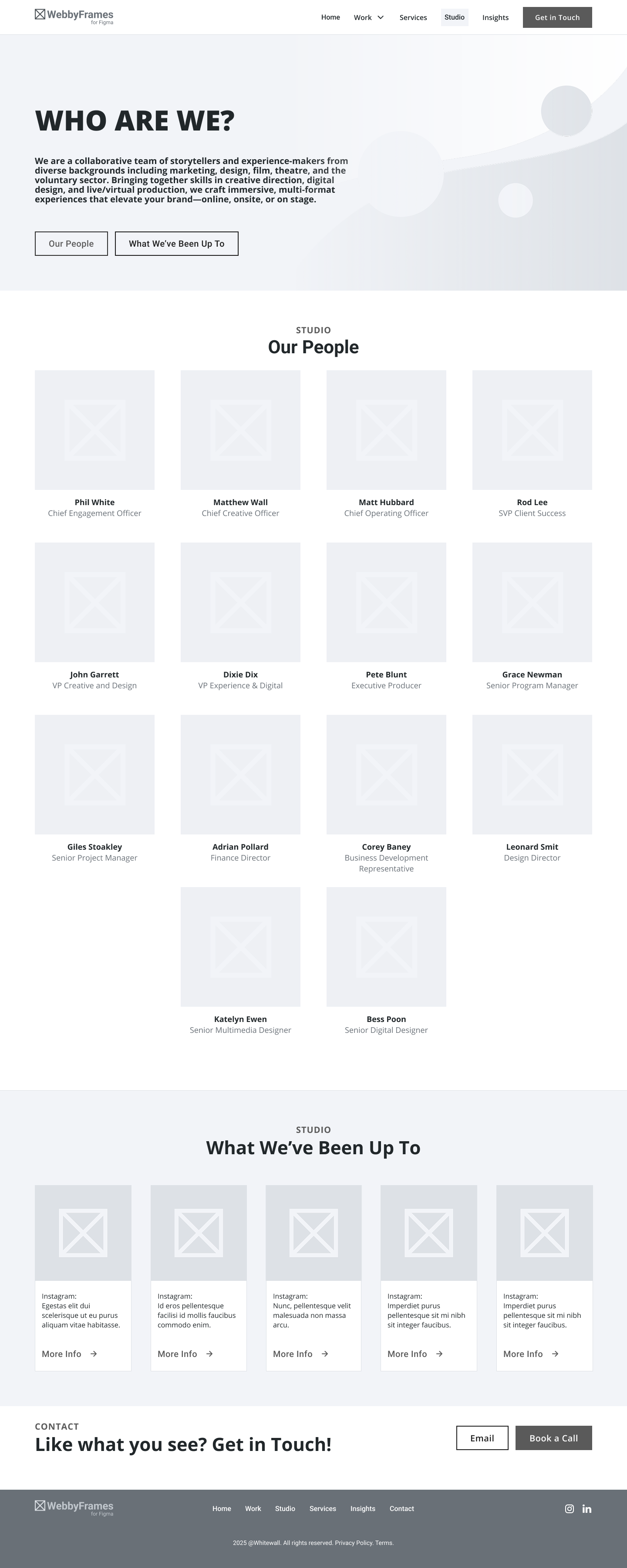
Who are we
In response to Users confusion around the term "Studio" to represent the About page, I changed the header navigation to read "Who We Are".
In response to a need for cleaner visuals and a need for more clarity on the purpose of the section, I altered the "What We've Been Up To" section to offer a more fixed variety of cultural examples and added some contextual company values copy around how we spend our time outside of work.

Contact
In response to Users request for more contact features, like the feature of direct email contact, I added an email contact feature to the main header on the contact page as well as navigation blocks to the different types of contact.
I also moved the Calendly below the contact form in response to users concern and added a physical address and phone number to increase trust.

High-Fidelity Prototype
In order to have a happy marriage of the company's current solution and assess user's needs, I integrated a palette that was trimmed down from the original red, white, and blue and instead focused on a purple-blue, yellow, and dark grey. The "burple" offers trust and modernity while the yellow injects energy and the dark grey keeps the website easy on the eyes for people looking at the website in different time zones.
I integrated a neon sign motif throughout to give the same energy as the logo while instilling the company's 360 offering.
In this version, mission and culture have been prioritised. With contact-ability remaining a key factor to make sure people can get in touch if they like what they see.
Descriptions have been added in the headers to give users valuable context to the company and what they would be getting.


Prototype User Testing
Task 1 | Show me how you assess the prior experience of the company
Task 2 | Show me how you learn more about the company's culture
Task 3 | Show me how you reach out to the company
Insights
Tasks
Users need consistency but not overuse of similar blocks when evaluating work because it hints at a low quantity of work
Users need the style to feel inviting because they need to feel safe trusting the company

Users need some forms of hover information because sometimes they would like to know more, especially with evaluations of culture
Users need to see values because often that is a determining factor when evaluating a company
Delivery
Final Solution
The final solution for Whitewall Creative aims to offer more clarity to users on the company's offerings, who the company is, and what their processes look like. The aim is to be transparent and offer users a variety of means of gaining insight from the scanners to the users who want to do a deep dive.
View the prototype here!
Next Steps
Conduct AB Testing of new solution versus current solution to assess whether or not the solution better meets user's needs
Create a mobile version and a light-mode version of the prototype and present to the internal team for review
Develop a plan outside of the solution to meet overall service design goals i.e. improving SEO, developing social media plan
Rounded Corners
Final Solution Changes
Based on user's feedback, I added subtle rounded corners throughout because trust and approachability is a key problem to users and the rounded corners provide a softness to a bold brand.


Objectives

Who are we
I added a hover feature to the "What We've Been Up To" section so that users could gain more context about exactly what the company has been up to, giving more insight to the culture of the company.
In regards to values, the company's stated values pertain more to work than and general life principles like "Making Every Moment Count" so that will need to be evaluated internally before deeper values can be added to the solution.
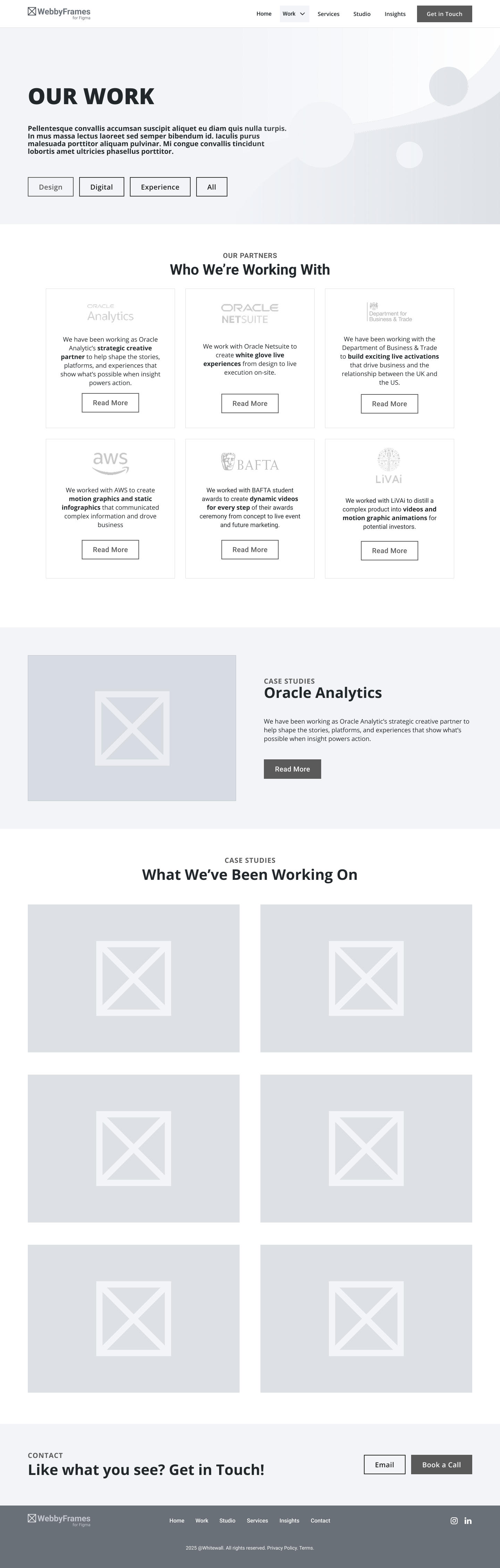
Work Page
I also removed the Featured case study block from the Work page so that users could get straight to the type of work that they are looking for without distraction, and to reduce overuse of repetition.