

Prospect
EXPERIENCE DESIGN | RESEARCH | BRANDING
Background
Prospect is an distopian sci-fi film about a teenage girl and her father traveling to a remote alien moon, aiming to strike it rich. But there are others roving the wilderness and the job quickly devolves into a desperate fight to survive.
Problem
The audience needed to feel immersed in a completely new alien universe. With only a couple of hours to accomplish this, the world needed to tell the rest of the story. Utility, cost, weight, and implications for life in an alien frontier had to be considered.
Solution
The props, sets, and costumes were designed with a rigorous attention to detail with each having its own backstory. Every detail was attuned, down to creating a new language that could be learned by fans after the film.
Client
Shep Films
Role
Graphic Designer
Team
Directors, Art Department Supervisor, Production Designer, Graphics Designers
Duration
12 weeks
Discovery and Definition
Research and Direction
Though Prospect entirely takes place on the uncivilized frontier of the galaxy, the directors still wanted to there to be evidence of civilisation buried in the corners. Pop culture, religion, politics and consumer goods were all facets of humanity they wanted the audience to encounter. Though this universe was not our own, we drew reference from lots of corners of our own world. The aesthetic was nicknamed “painted rust,” a reference to the industrial output generated at breakneck speed by the USSR.
That time period inspired much of the designs, as well as science-fiction references like Jodorowsky’s Dune. The graphics needed to ride the line between future and past, expressing the progressive spirit of space travel, but grounded by utilitarian and economic realities.
Design
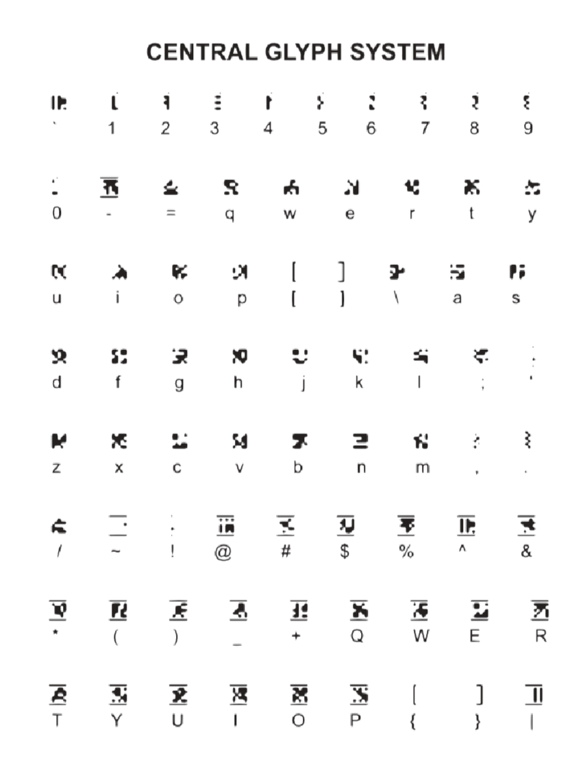
The Language
Before we could develop anything, the first step was to create an in-world alphabet and numeric system, which was developed by our concept artist. The alphabet had a formal calligraphic character system as well as a machine glyph system, which was hand-drawn and then I digitized it, and we would later develop a third alphabet system suited for handwriting.
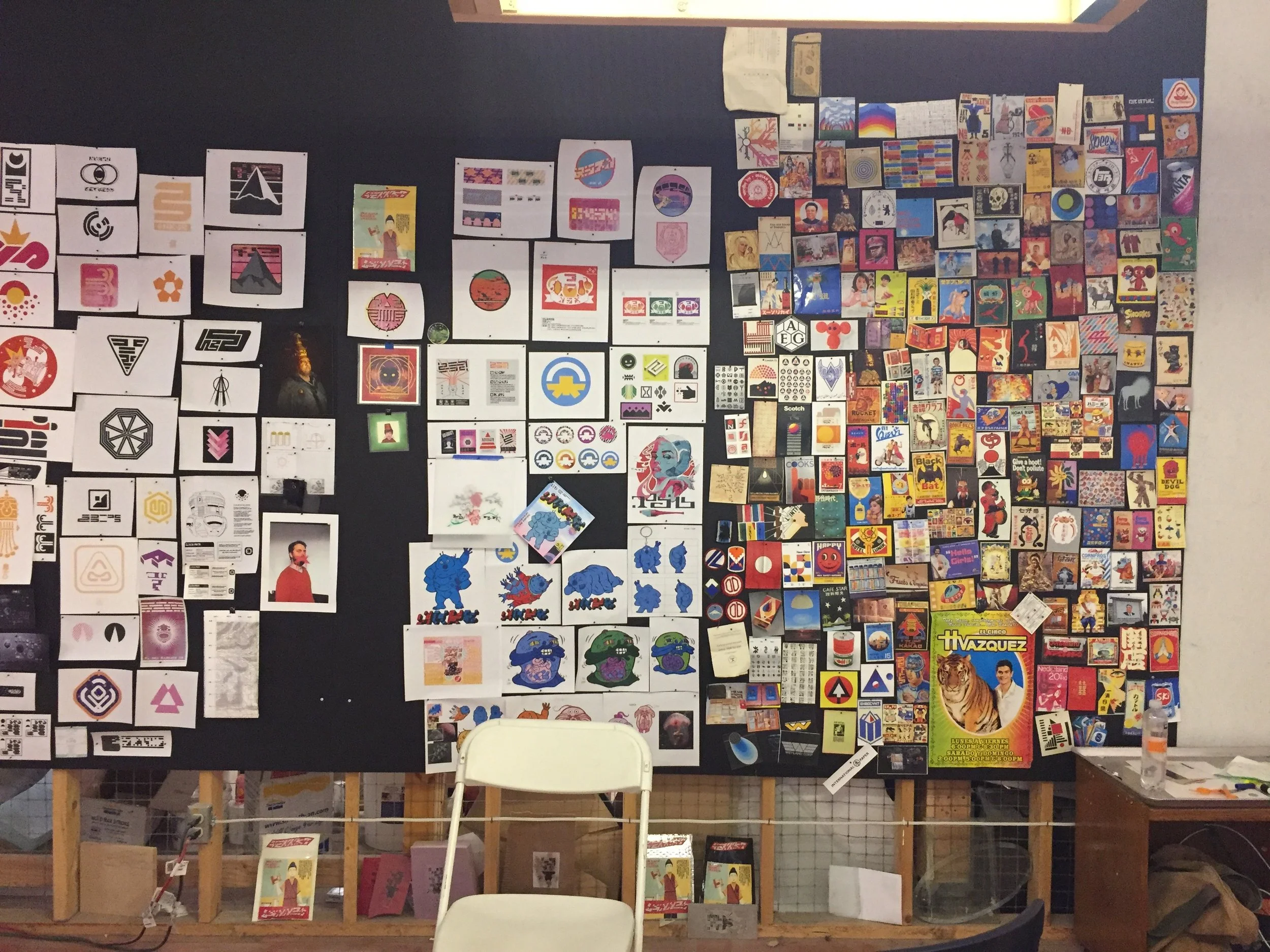
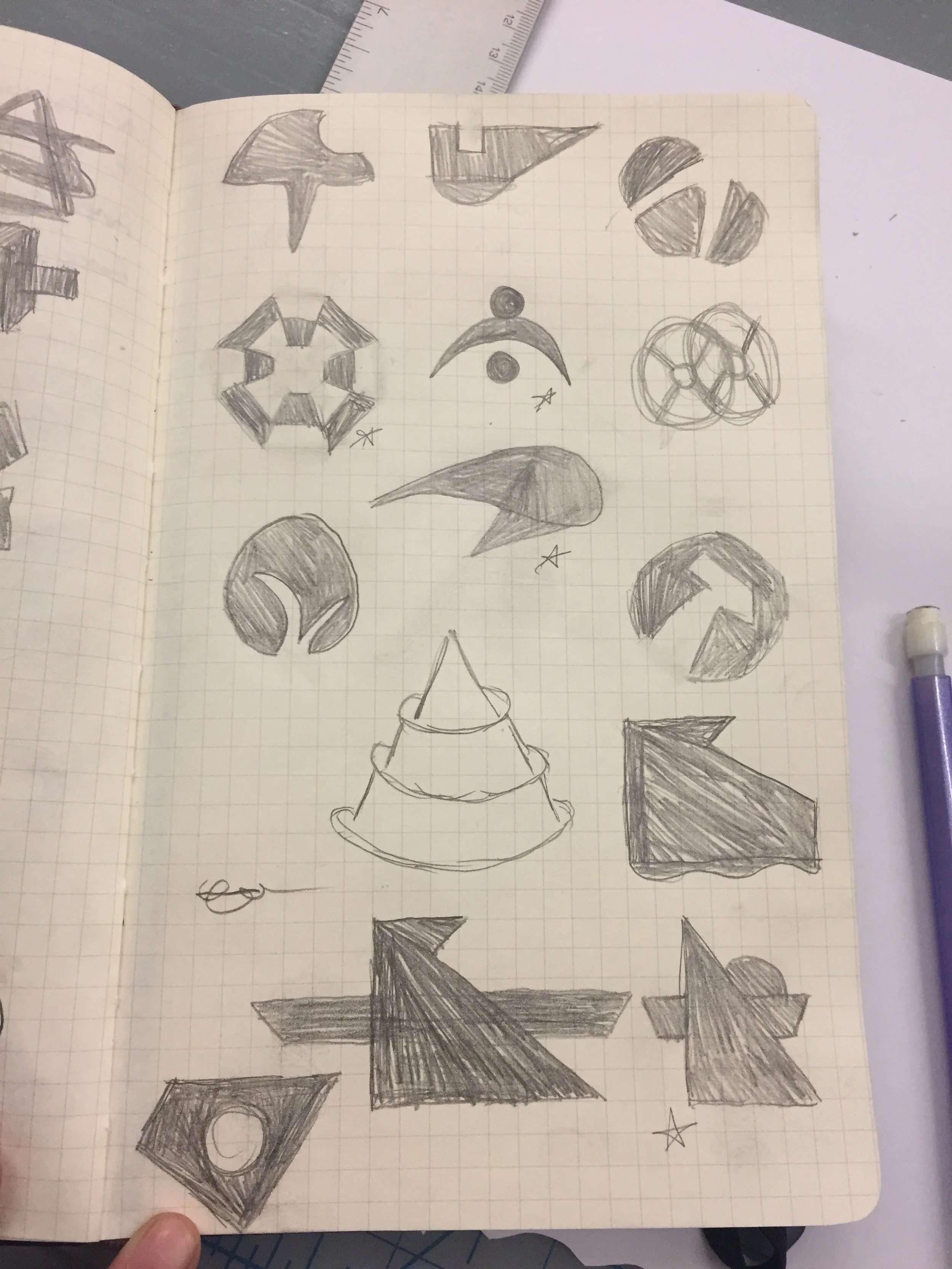
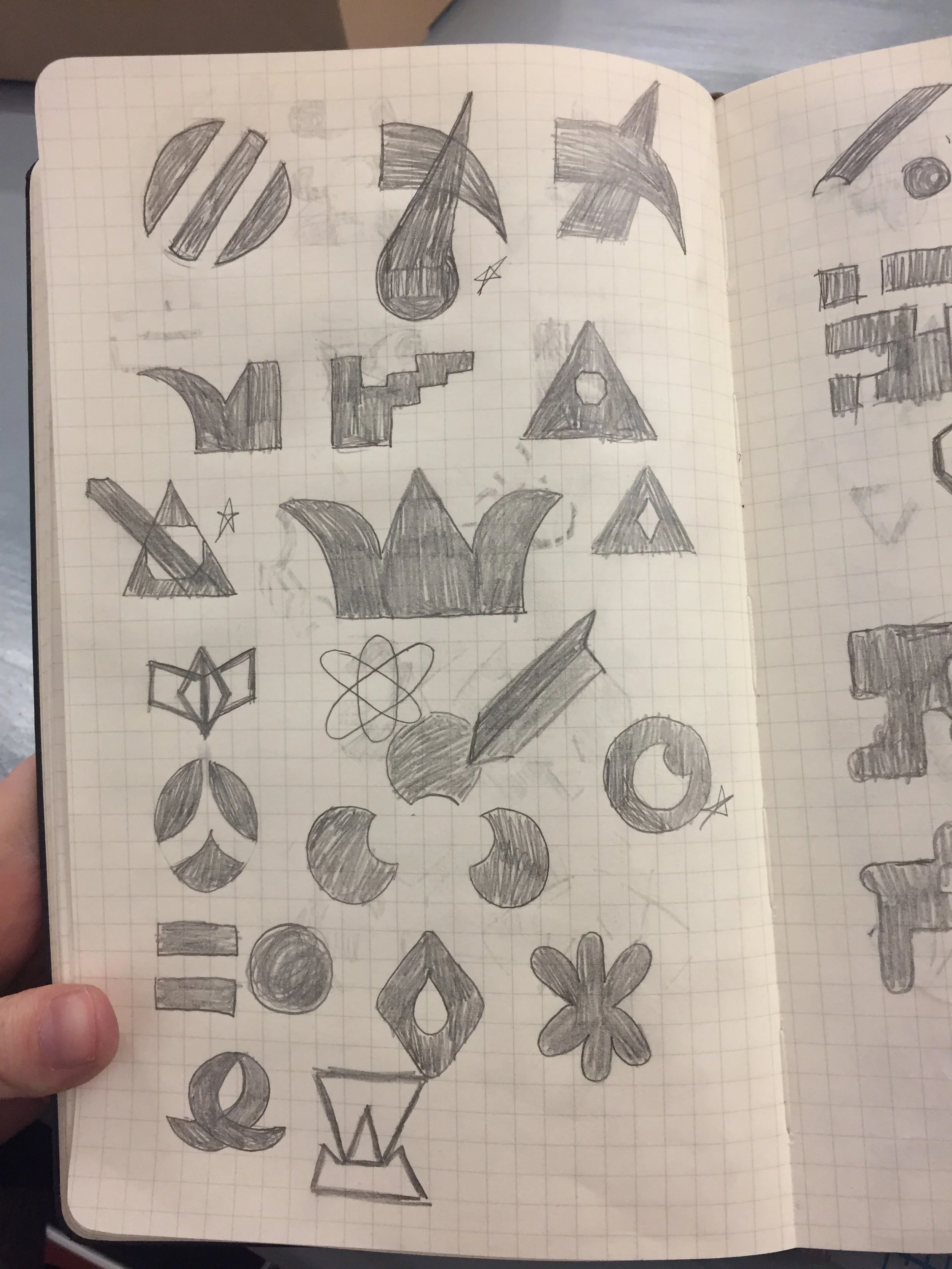
Sketches
Digital Designs
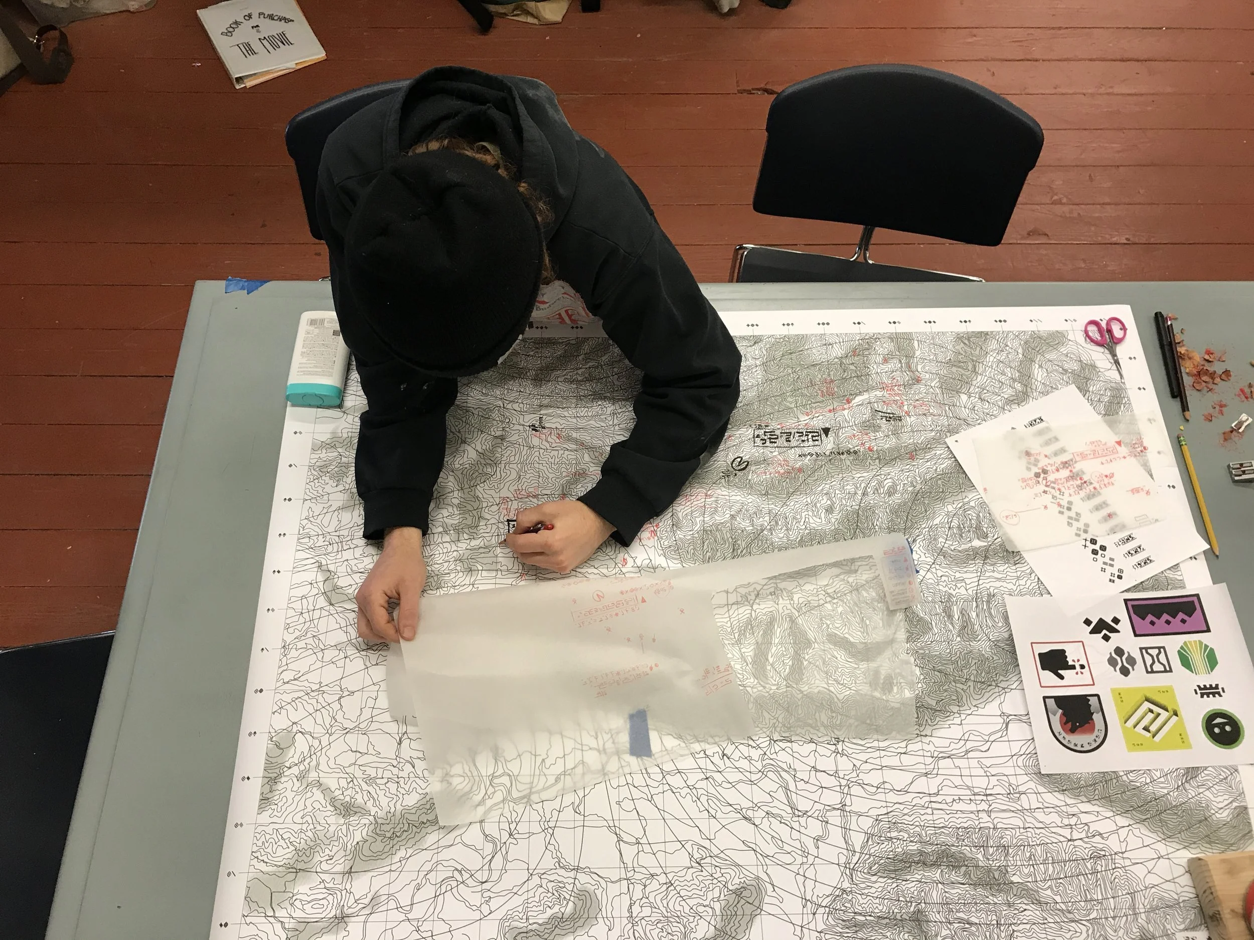
Then we could begin implementing the designs into digital files that would be printed in various mediums and treated to bring them to life. A particular prop that required many hands, was the map that the main character holds. I drew it based off the landscape of the shooting location, we then printed it on waterproof banner material, to give it that future feel, and ready for a rugged landscape. Then our illustrator made handwritten notes on it in the language of the film. Then we dragged it on the ground, rubbed it in dirt, and roughed it up to give viewers the feeling it was well-worn.
Each piece of graphic material went through the same process of story, sketching, design, and ageing to help fully immerse the viewer in the world.
We developed countless sketches for all the brands that needed to live in the world, from space U-Haul, to shipping containers, every detail was considered. Development was key to maintaining the grounded, yet alien aesthetic.
Then we could begin implementing the designs into digital files that would be printed in various mediums and treated to bring them to life. A particular prop that required many hands, was the map that the main character holds. I drew it based off the landscape of the shooting location, we then printed it on waterproof banner material, to give it that future feel, and ready for a rugged landscape. Then our illustrator made handwritten notes on it in the language of the film. Then we dragged it on the ground, rubbed it in dirt, and roughed it up to give viewers the feeling it was well-worn.
Each piece of graphic material went through the same process of story, sketching, design, and ageing to help fully immerse the viewer in the world.


Delivery
Printing, Ageing, and Application
The digital files would then be printed in various mediums, applied to props, and treated to bring them to life. A particular prop that required many hands, was the map that the main character holds. I drew it based off the landscape of the shooting location, we then printed it on waterproof banner material, to give it that future feel, and ready for a rugged landscape. Our illustrator made handwritten notes on it in the language of the film. Then we dragged it on the ground, rubbed it in dirt, and roughed it up to give viewers the feeling it was well-worn.
Each piece of graphic material went through the same process of story, implementation and ageing to fully immerse the viewer in the world.
Final Delivery
The following are graphics that helped bring the world of Prospect to life for the viewer.
On Screen

The Trailer


